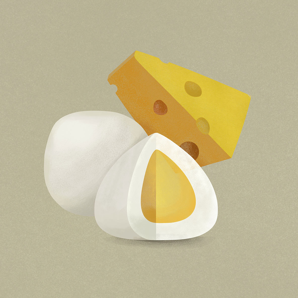
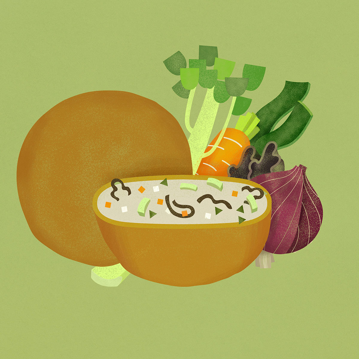
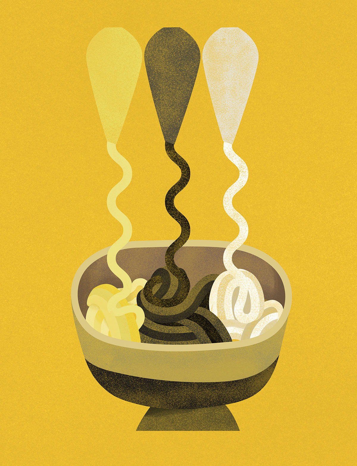
Illustration for a series of surimi packaging. As the products looked similar to each other, the illustration is to bring out their distinctive flavours by highlighted their fillings and the raw material used. A rich yet muted colour palette is selected such that the products stand out on shelf. Clean lines with slightly rounded geometrical shapes to bring out the product's texture (bounciness) and its kawaii element.